The home of the unconventional.
MCEC

Client
Melbourne Convention and Exhibition Centre
COMPLETED AT
FutureBrand Australia
AWARD
ANZ Transform Awards 2021 – Silver, Best Visual Identity (Leisure & Tourism)
ANZ Transform Awards 2021 – Silver, Best Brand Development
ANZ Transform Awards 2021 – Highly Commended, Best Brand Evolution
Type
Brand Identity
Scope
Custom Wordmark
Colour Palette
Graphic Device
Brand Guidelines
About
As Victoria’s largest public asset, the Melbourne Convention and Exhibition Centre wanted to be seen as more than a venue – a home for the community. The pandemic forced MCEC to rethink how it operates, and with rising competition it needed a clear purpose to carry it forward. The refresh future-proofs the brand while holding on to what people already know and love.


We kept the iconic ‘M’ and refined everything around it. The old wordmark sat too small and struggled to carry such a long name, so we developed a custom wordmark that works harder – more legible at every size, with distinctive details that give MCEC its own voice.
The graphic device takes its cue from the venue itself. MCEC’s spaces are modular, reconfigured again and again to suit every kind of community, so the visual language is built on a shifting, variable shape. It never sits still – the dynamism of the shape mirrors the dynamism of the venue, and it’s where the unconventional idea comes to life.



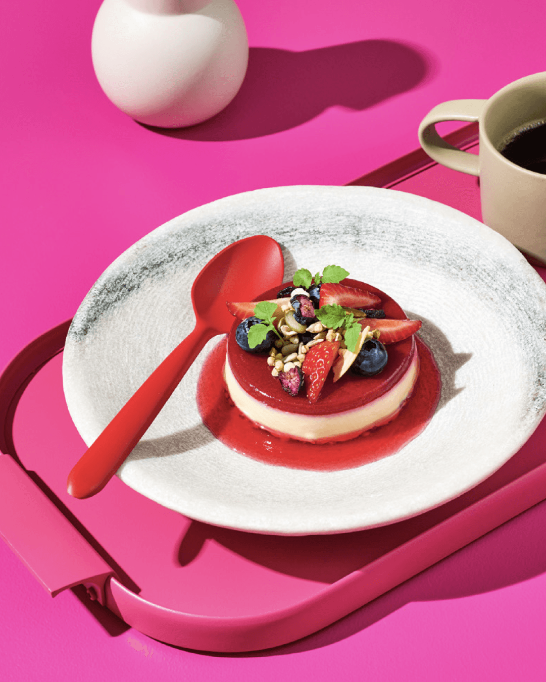
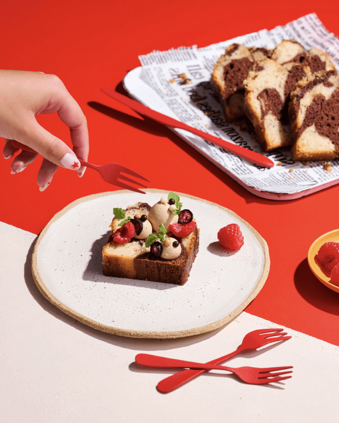
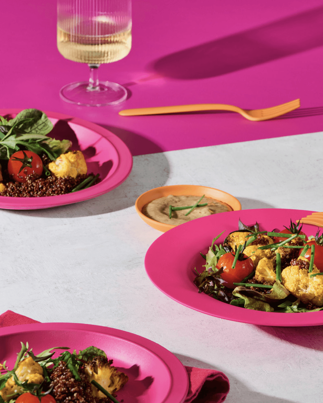
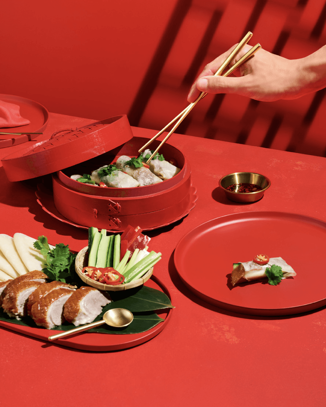



A streamlined palette of bold reds, oranges and pinks keeps the system warm and confident, carrying it from signage and print through to out-of-home and social.


Since the refresh, MCEC has embraced the new normal – training guide dogs, launching Australia’s first indoor drive-in cinema and serving as a vaccination hub. The brand now carries the bold, creative spirit behind all of it.
Credits
Credits
Website Design & Build
AQKA
Motion & Imagery
MCEC in-house team
More works
