Sector: Art and Culture
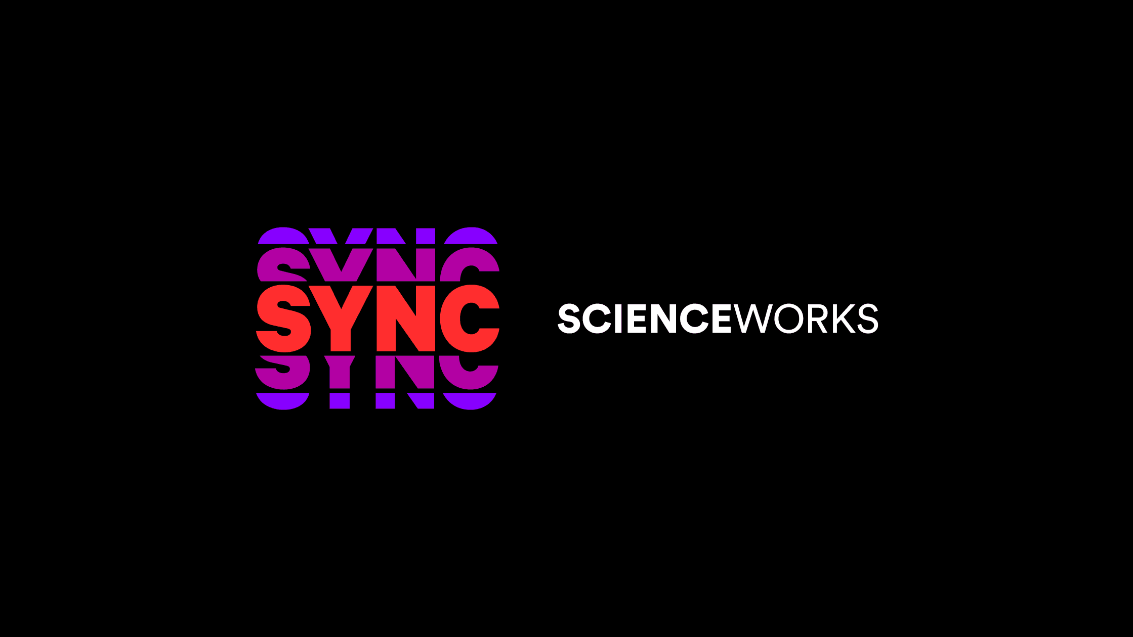
SYNC
Project Overview
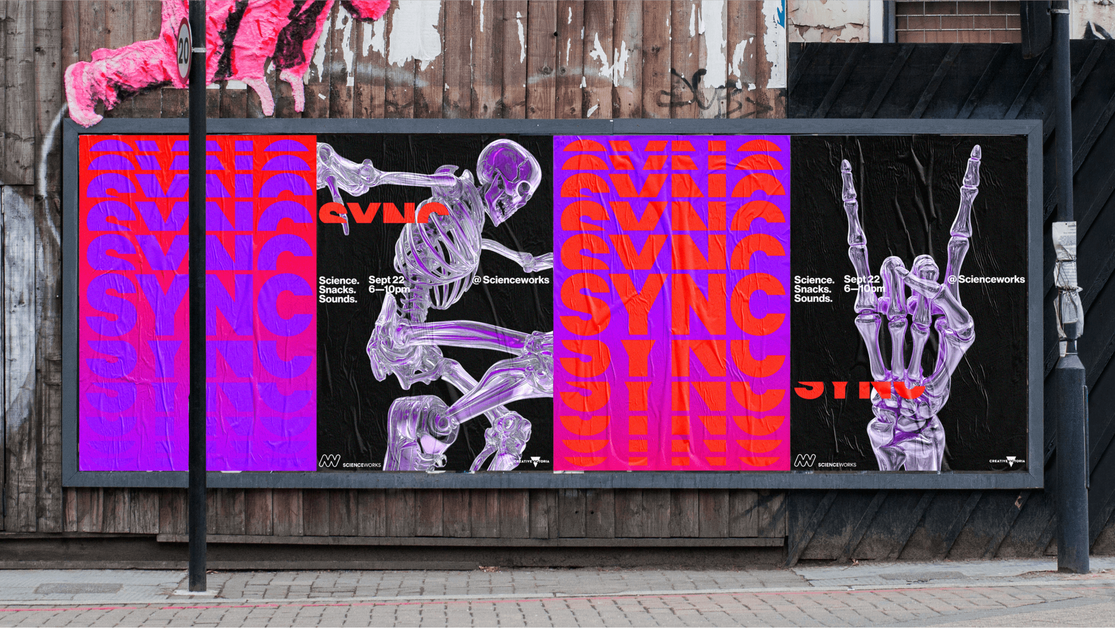
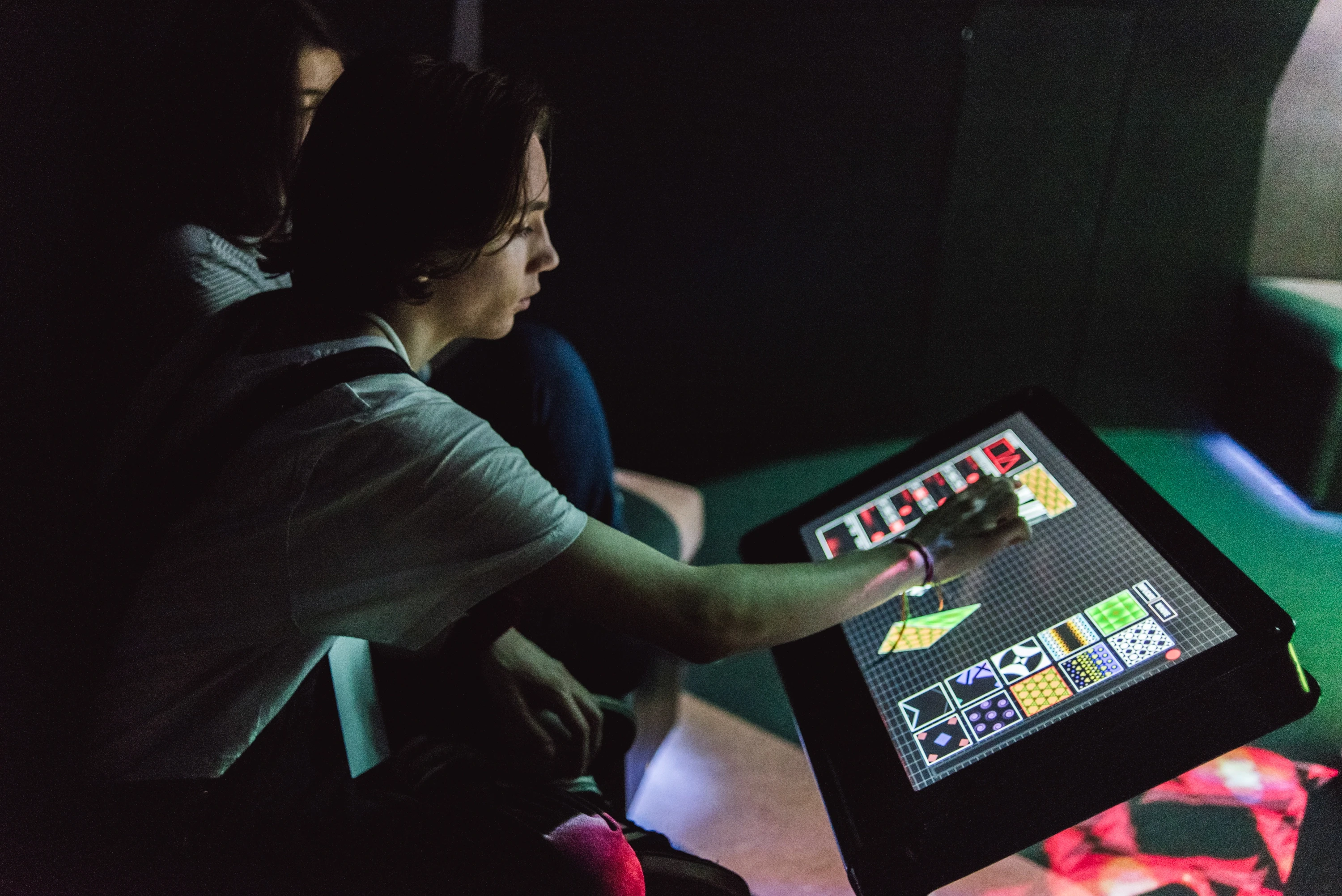
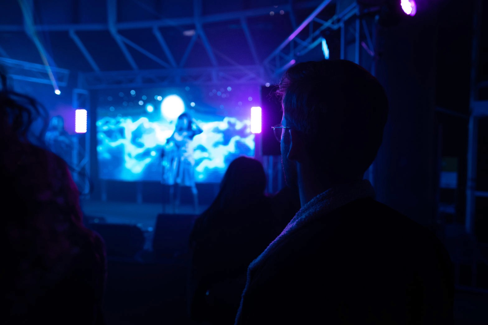
SYNC was an after-hours party for under-18s, packed with music, tech and VR. Held at Scienceworks, the event aimed to connect with a teen audience and reframe the museum as a place of energy, creativity and fun.
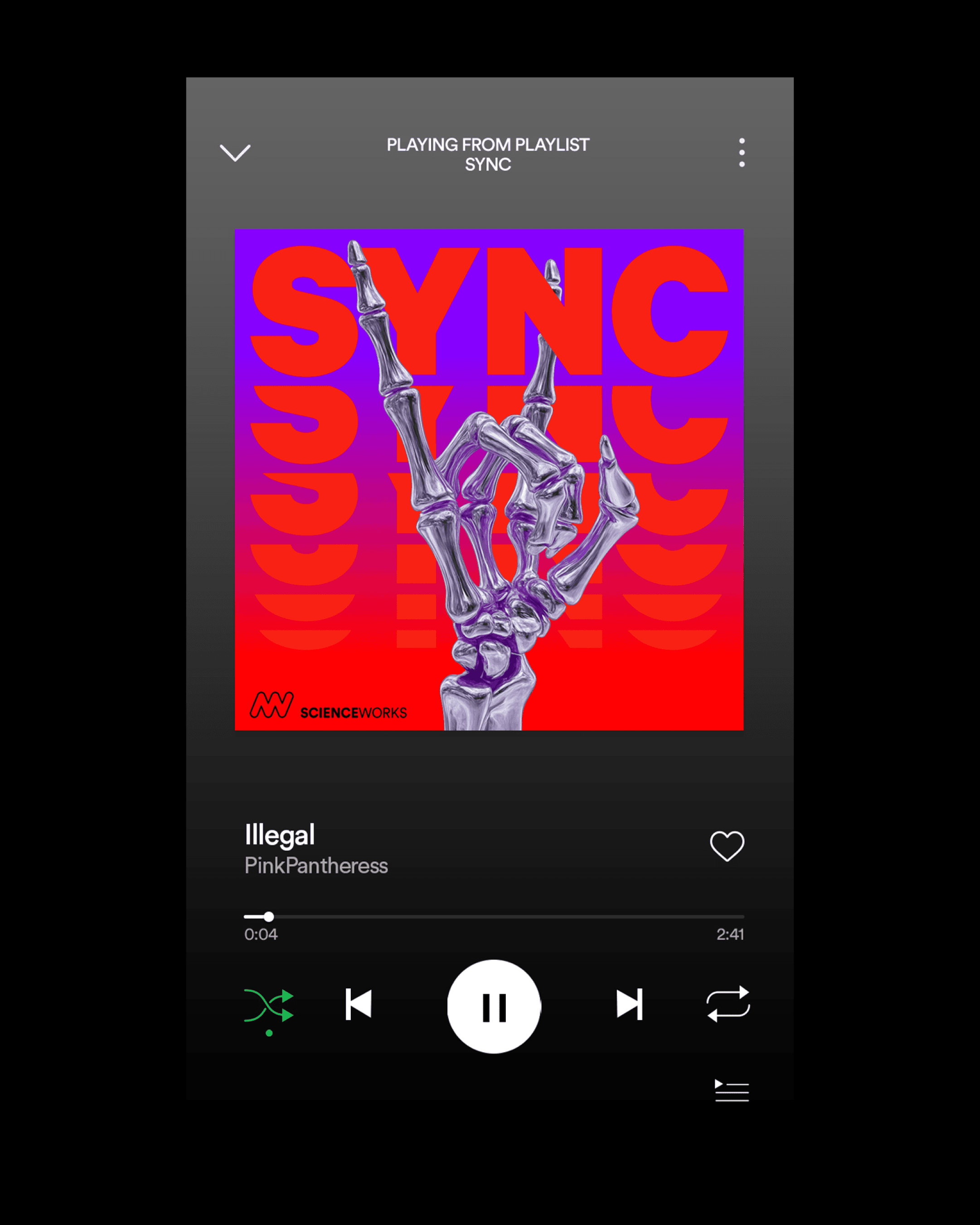
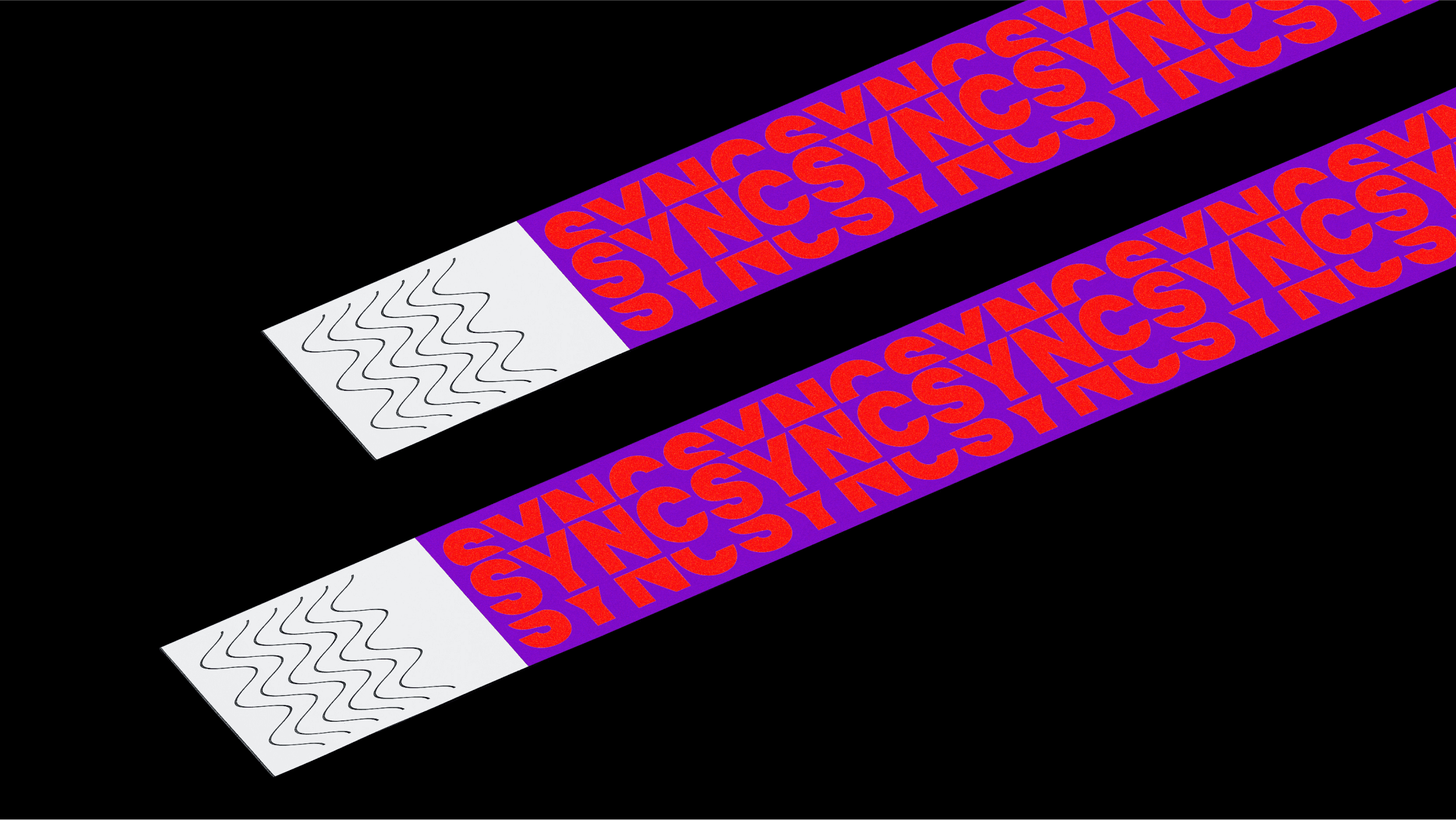
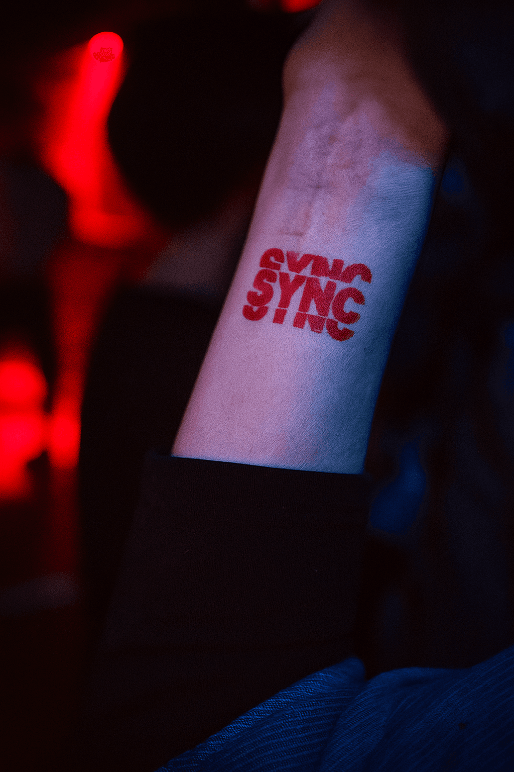
The logo was built around the name itself — SYNC — with bold, rhythmic typography that feels like it’s pulsing with sound and movement. It set the tone for a dynamic identity that could flex across everything from wristbands to Spotify playlists.
The skeletons were a playful nod to the classic dioramas at Scienceworks. Turning them into chrome dancers gave the museum a fun, physical presence at the event, almost like Scienceworks itself was joining the party.
To stay within budget, we used AI tools to help create the skeleton visuals. This allowed us to build something distinctive and memorable, while also tapping into the spirit of technology, experimentation and imagination that defines Scienceworks.
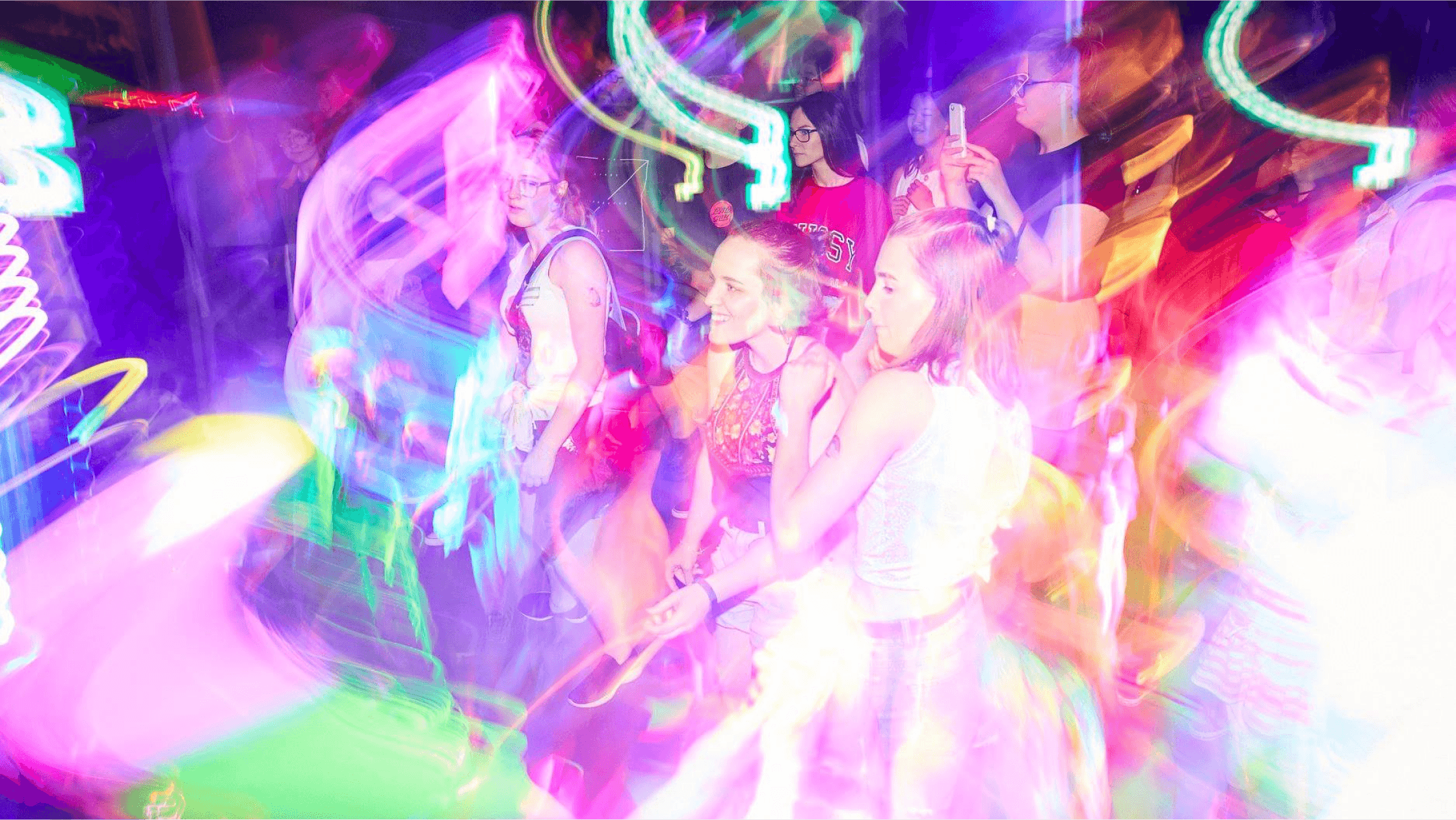
The result was a sold-out event, strong word of mouth and a fresh way for young audiences to experience the museum.
The Melbourne Convention and Exhibition Centre (MCEC), as Victoria's largest public asset, aimed to reposition its brand as more than just a venue, but a home for the community. Before the pandemic, the centre enjoyed a decade of success, but the global crisis forced MCEC to rethink its operations, finding the courage to pivot and reimagine its approach, not just to survive, but to thrive.
In the post-Covid world with rising competition, MCEC reflected deeply to define a clear purpose that would inspire engagement. The goal was to future-proof the brand while preserving its iconic "M" symbol. A refreshed brandmark balanced tradition with modernity, highlighting MCEC’s strength in making impactful personal connections, big and small. This clarity gave the brand a purpose rooted in creating meaningful experiences.
A new brand system harmonised all identity elements to assert MCEC's distinctiveness, including a dynamic graphic device reflecting the venue’s flexibility. The streamlined colour palette emphasised bold shades of red, orange, and pink, while unique typographic features added character. Since adopting its refreshed identity, MCEC has embraced the "new normal," repurposing its space for innovative uses like training guide dogs, launching Australia’s first indoor drive-in cinema, and serving as a vaccination hub. The revitalised brand embodies MCEC's bold, creative spirit.