Sector: Leisure and Entertainment
Completed at FutureBrand
Motion & imagery: Internal team
Website: AQKA
MCEC
Project Overview
The Melbourne Convention and Exhibition Centre (MCEC), as Victoria's largest public asset, aimed to reposition its brand as more than just a venue, but a home for the community. Before the pandemic, the centre enjoyed a decade of success, but the global crisis forced MCEC to rethink its operations, finding the courage to pivot and reimagine its approach, not just to survive, but to thrive.
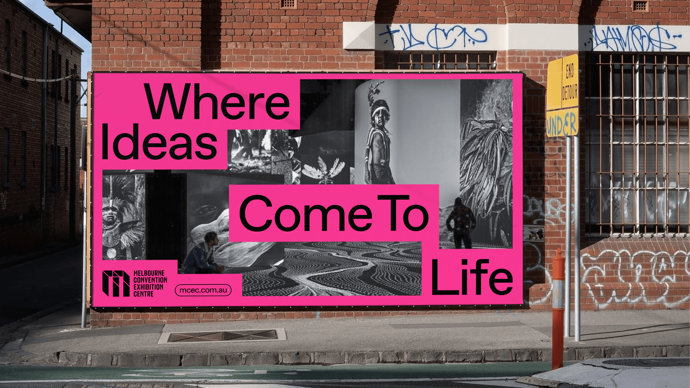
In the post-Covid world with rising competition, MCEC reflected deeply to define a clear purpose that would inspire engagement. The goal was to future-proof the brand while preserving its iconic "M" symbol. A refreshed brandmark balanced tradition with modernity, highlighting MCEC’s strength in making impactful personal connections, big and small. This clarity gave the brand a purpose rooted in creating meaningful experiences.
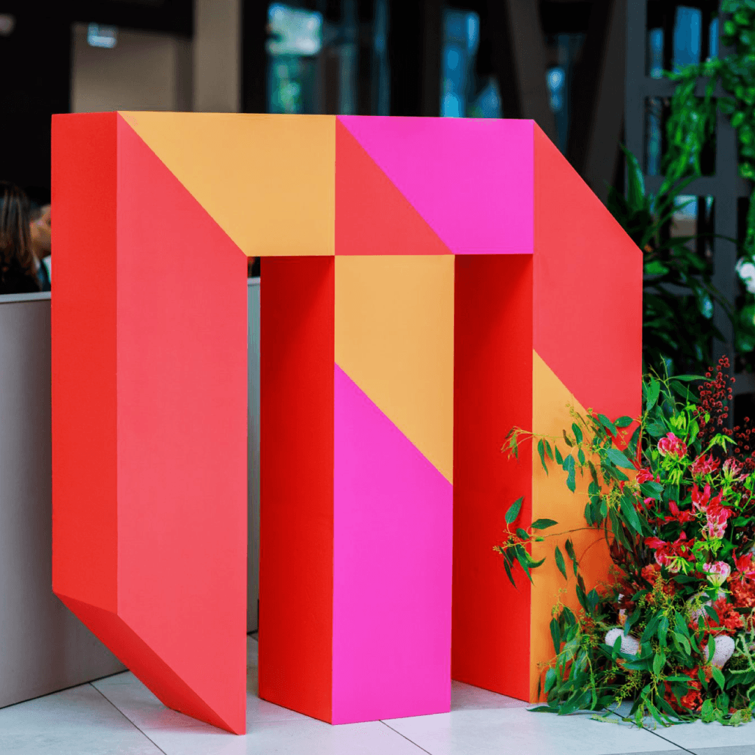
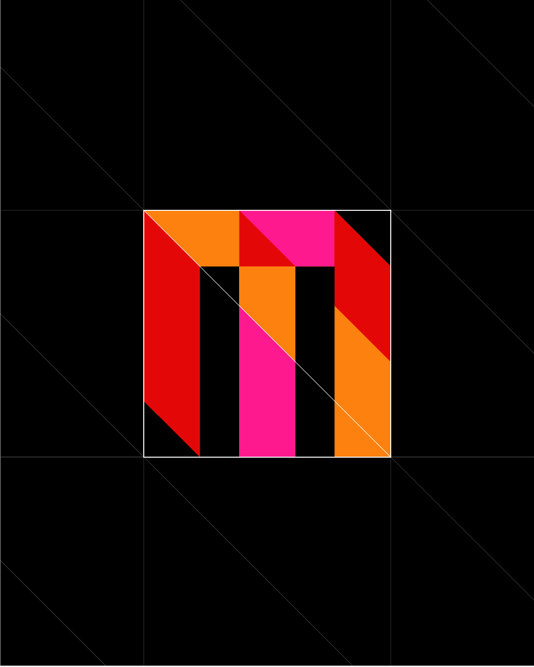
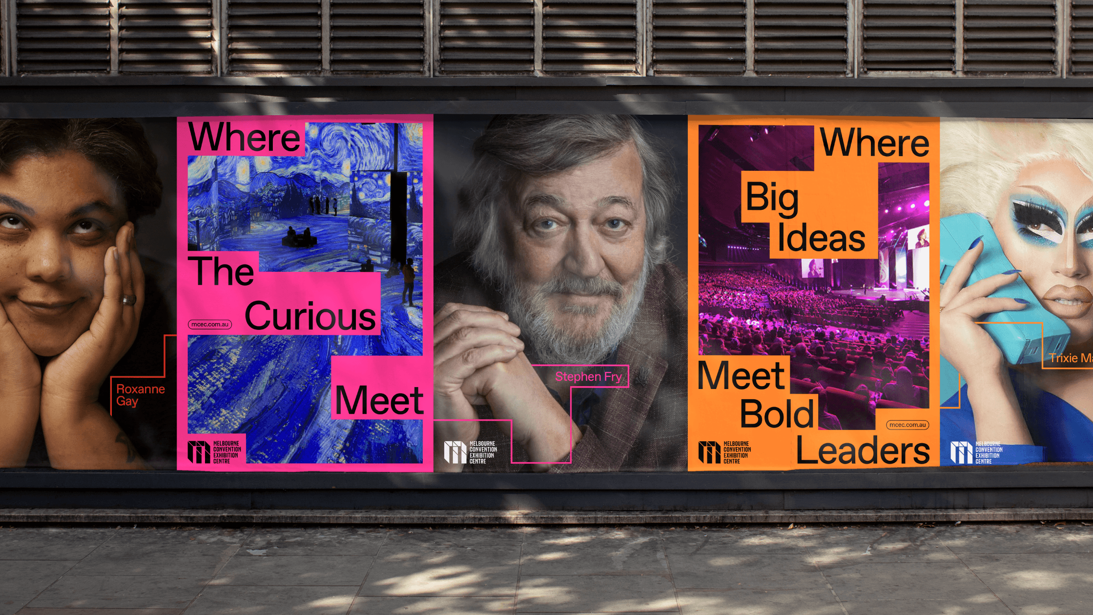
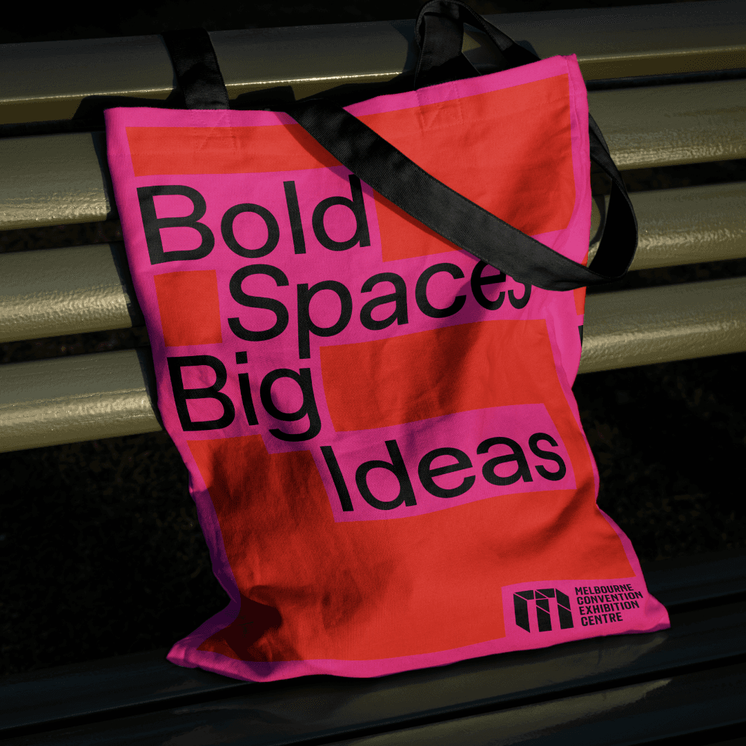
A new brand system harmonized all identity elements to assert MCEC's distinctiveness, including a dynamic graphic device reflecting the venue’s flexibility. The streamlined colour palette emphasized bold shades of red, orange, and pink, while unique typographic features added character. Since adopting its refreshed identity, MCEC has embraced the "new normal," repurposing its space for innovative uses like training guide dogs, launching Australia’s first indoor drive-in cinema, and serving as a vaccination hub. The revitalized brand embodies MCEC's bold, creative spirit.
The Melbourne Convention and Exhibition Centre (MCEC), as Victoria's largest public asset, aimed to reposition its brand as more than just a venue, but a home for the community. Before the pandemic, the centre enjoyed a decade of success, but the global crisis forced MCEC to rethink its operations, finding the courage to pivot and reimagine its approach, not just to survive, but to thrive.
In the post-Covid world with rising competition, MCEC reflected deeply to define a clear purpose that would inspire engagement. The goal was to future-proof the brand while preserving its iconic "M" symbol. A refreshed brandmark balanced tradition with modernity, highlighting MCEC’s strength in making impactful personal connections, big and small. This clarity gave the brand a purpose rooted in creating meaningful experiences.
A new brand system harmonised all identity elements to assert MCEC's distinctiveness, including a dynamic graphic device reflecting the venue’s flexibility. The streamlined colour palette emphasised bold shades of red, orange, and pink, while unique typographic features added character. Since adopting its refreshed identity, MCEC has embraced the "new normal," repurposing its space for innovative uses like training guide dogs, launching Australia’s first indoor drive-in cinema, and serving as a vaccination hub. The revitalised brand embodies MCEC's bold, creative spirit.