Sector: Consumer Technology
Illustration: Chris Costa
Completed at FutureBrand
hipages
Project Overview
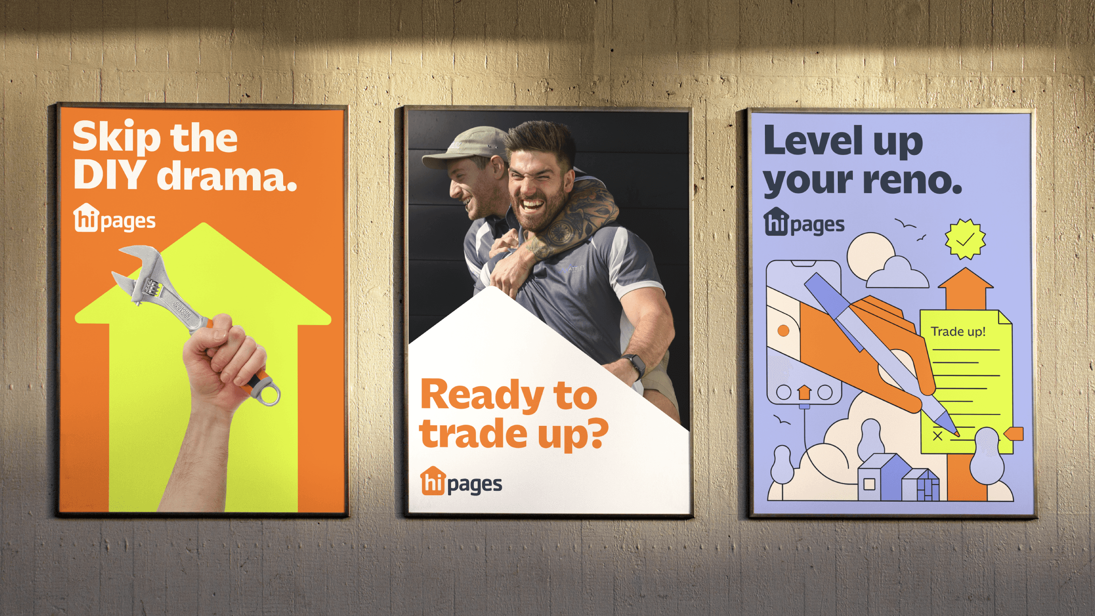
hipages, a pioneer in Australian home improvement, has undergone a brand refresh to match its continued evolution. The new brand identity builds on the energy and trust that have made hipages a household name, with a focus on a brighter future, a consistent experience, and a refreshed platform for continued growth.
The iconic hipages orange has been intensified, making it even more eye-catching. The cool steel shade reflects the reliability and confidence users feel when connecting with trusted tradies, while plaster keeps things grounded and ensures important information is easy to find. For those extra special moments, the blueprint and hi-vis accents add a burst of energy, making the hipages experience fun and unforgettable.
To ensure a consistent brand experience across all touchpoints, hipages' house symbol has been evolved into a dynamic arrow graphic. This upward-pointing arrow represents the "Trade Up" brand idea, serving as both a functional tool for organizing content and a unique, ownable brand asset.
The brand refresh is more than just aesthetics. It's a foundation for hipages to continue building its story as it evolves its business. With a refreshed brand, hipages is ready to take on the future, one project at a time.